


by Pedro Medina Leandry
2021
Contextual
Glyphs
Languages
- Open Type Font
- Commercial Use
A symbolic revival of the Normandie Hotel
The once majestic Normandie Hotel, nestled in Puerta Tierra, first welcomed guests in 1942, capturing hearts with its Streamline Moderne and Art Deco charm. Sadly, since 2011, the hotel has stood abandoned, a silent monument to bygone memories. Drawing inspiration from the hotel's sleek aerodynamics and long, parallel lines that graced its façade, the Normandi typeface serves as a symbolic revival. With two sets of capitals and a simpler, more readable style, this font evokes a minimalist yet balanced Art Deco atmosphere. What sets Normandi apart from other Art Deco fonts is its stable letter structure and reasonable proportions. Its standout feature? A clever style-shifting mechanism that seamlessly transitions from Art Deco capitals to a sensible geometric sans in sentence case. Even if the lonely hotel structure fades away, this font will endure, a timeless reflection of its enduring charm.
Normandi In The Wild
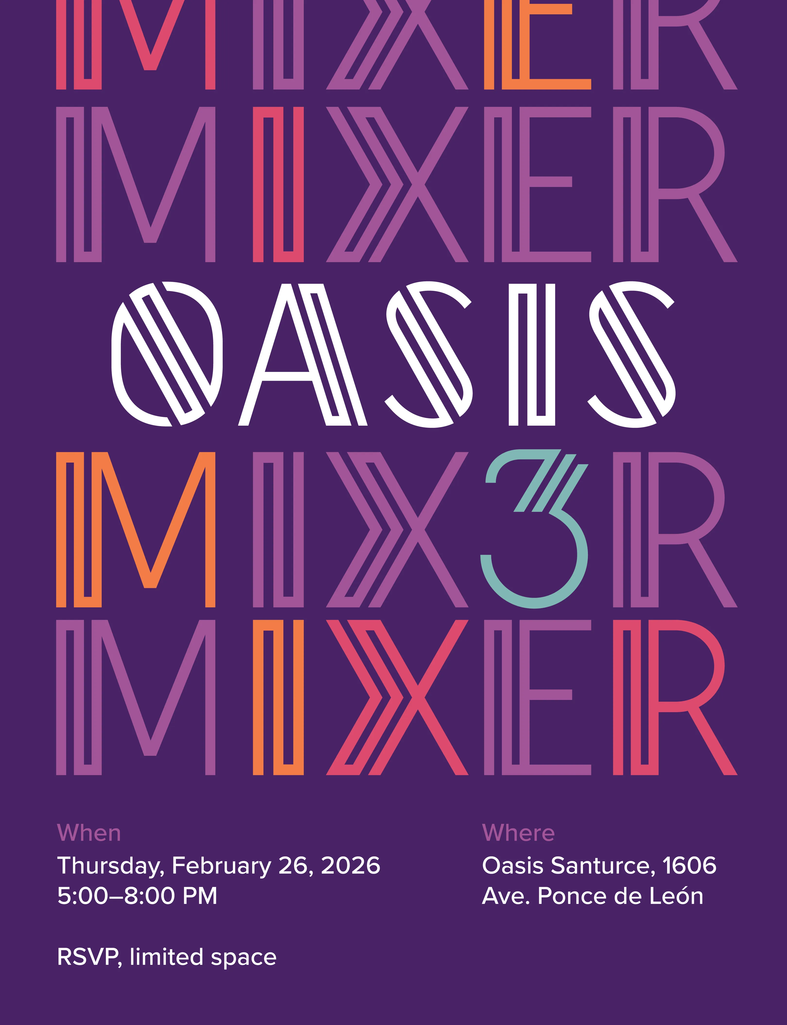
by Oasis Santurce
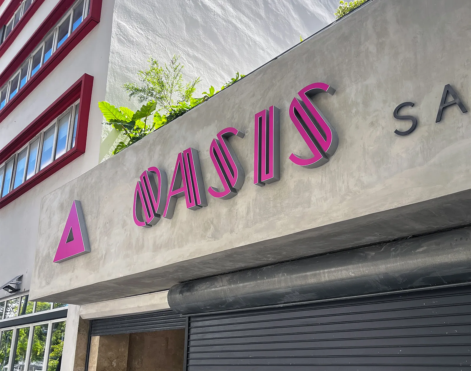
by Oasis Santurce
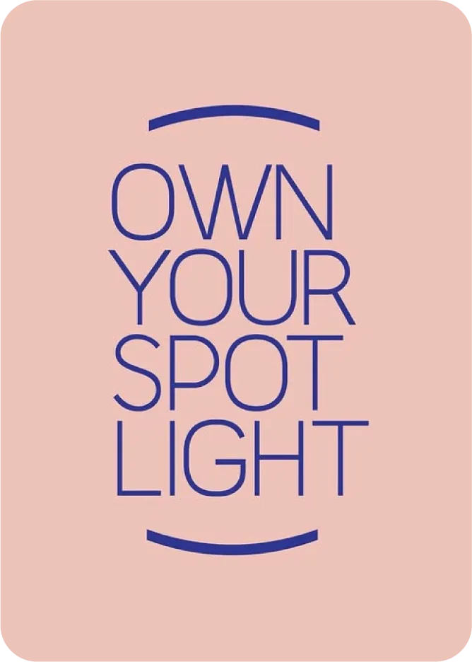
by Natalia Skurman
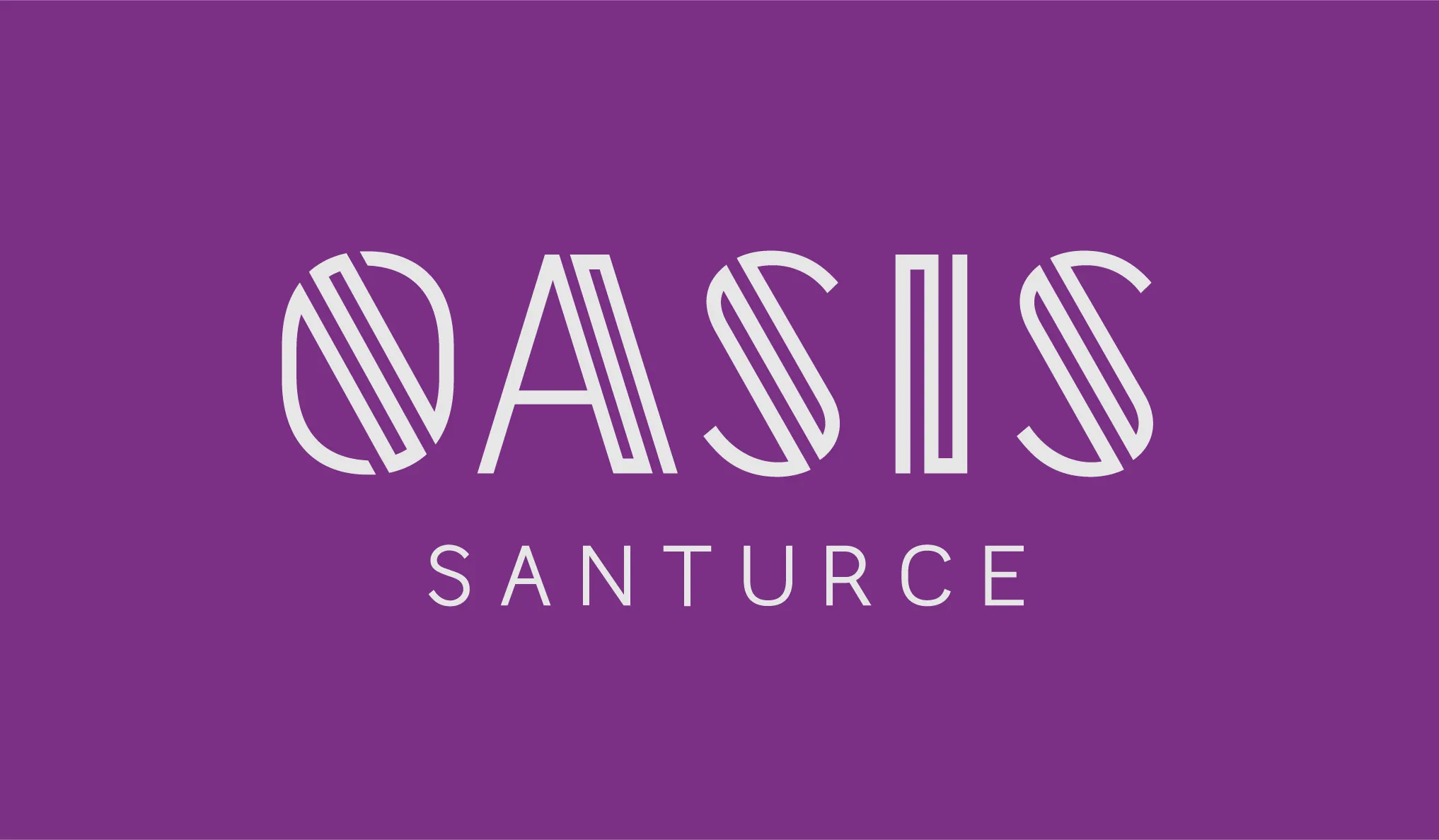
by Oasis Santurce